How to Read a Crypto Trading Chart: A Beginner’s Guide
Ever looked at a crypto chart and felt like you were staring into the Matrix?
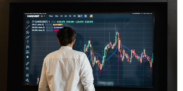
You’re not alone. For many newcomers, trading charts look like a chaotic mess of green and red candles, mysterious lines, and cryptic indicators. But here’s the truth: once you understand the basics, charts become one of your most valuable tools as a crypto trader.
In this guide, we’ll break down how to read a crypto trading chart step by step—no prior experience needed. By the end, you’ll be able to look at a chart and actually understand what’s going on.
1. What Is a Crypto Trading Chart (and Why Should You Care)?
Think of a trading chart as the heartbeat of a cryptocurrency—it shows you how its price has moved over time. Charts are essential because they help you:
-
Spot trends (Is the price going up, down, or sideways?)
-
Time your entries and exits
-
Manage risk
-
Make informed, data-driven decisions
You wouldn’t drive a car with your eyes closed, right? Trading without reading charts is just as risky.
2. Understanding the Candlestick: Your First Friend on the Chart
You’ve probably seen red and green "candles" stacked across the chart. These aren’t just pretty visuals—they’re powerful data packets.
What is a candlestick?
Each candlestick represents price movement over a specific time frame (e.g., 1 minute, 1 hour, 1 day).
Here’s what each candle shows:
-
Open price: Where the price started during that time
-
Close price: Where the price ended
-
High: The highest price reached
-
Low: The lowest price reached
Green candle = Price went up
Red candle = Price went down
📌 Example: On a 1-hour chart, each candle shows how the price behaved during one hour. If the green candle opens at $25,000 and closes at $26,000—it means the price rose during that hour.
3. Timeframes Matter: Zoom In and Out
Charts let you choose your view—minutes, hours, days, or even weeks.
Why it matters:
-
Short-term traders (like day traders) often use 1-minute to 15-minute charts
-
Swing traders might use 4-hour or daily charts
-
Long-term investors prefer weekly charts for big-picture trends
Looking at different timeframes gives you a broader sense of market behavior. It's like zooming in and out of a Google Map—you need both the street view and the satellite view to plan your journey.
4. Spotting Trends: The Market Has a Mood
Markets move in trends, and recognizing them is key.
-
Uptrend: Higher highs and higher lows (a bullish sign)
-
Downtrend: Lower highs and lower lows (a bearish sign)
-
Sideways/Range-bound: Price bounces between a high and low zone
You can visualize these patterns by drawing trendlines on the chart—simple lines connecting highs or lows to see direction.
Tip: Never fight the trend. If the market is clearly rising, buying opportunities are usually stronger. If it’s falling, it might be best to wait or short (if you’re more advanced).
5. Popular Indicators to Know (Without Getting Overwhelmed)
Technical indicators add extra insight to your chart. Here are three beginner-friendly ones to start with:
a. Moving Averages (MA)
-
Smooth out price action to show the trend direction
-
Common types: 50-day MA, 200-day MA
-
If the price is above the MA = bullish; below = bearish
b. Relative Strength Index (RSI)
-
Measures momentum
-
RSI > 70 = overbought (price may drop soon)
-
RSI < 30 = oversold (price may rise soon)
c. Volume
-
Shows how much of the crypto is being traded
-
High volume = strong interest in the move
-
Low volume = weak or fake move
Just starting out? Stick to one or two indicators while you learn. Too many tools can create confusion instead of clarity.
Charts Don't Predict the Future, They Tell a Story
Reading a crypto chart won’t make you a fortune overnight, but it will give you a major edge. Every candle, trend, and line is a clue to what the market might do next. And the more you practice, the more confident you’ll become at spotting patterns and opportunities.
Ready to Dive In?
Open up a free chart on platforms like TradingView or your crypto exchange and explore. Try identifying trends, drawing support and resistance levels, or just watching how the candles form in real time.
What part of reading charts feels most confusing to you right now? Drop a comment—we’d love to help break it down.
Share This Post
Ever looked at a crypto chart and felt like you were staring into the Matrix?
You’re not alone. For many newcomers, trading charts look like a chaotic mess of green and red candles, mysterious lines, and cryptic indicators. But here’s the truth: once you understand the basics, charts become one of your most valuable tools as a crypto trader.
In this guide, we’ll break down how to read a crypto trading chart step by step—no prior experience needed. By the end, you’ll be able to look at a chart and actually understand what’s going on.
1. What Is a Crypto Trading Chart (and Why Should You Care)?
Think of a trading chart as the heartbeat of a cryptocurrency—it shows you how its price has moved over time. Charts are essential because they help you:
-
Spot trends (Is the price going up, down, or sideways?)
-
Time your entries and exits
-
Manage risk
-
Make informed, data-driven decisions
You wouldn’t drive a car with your eyes closed, right? Trading without reading charts is just as risky.
2. Understanding the Candlestick: Your First Friend on the Chart
You’ve probably seen red and green "candles" stacked across the chart. These aren’t just pretty visuals—they’re powerful data packets.
What is a candlestick?
Each candlestick represents price movement over a specific time frame (e.g., 1 minute, 1 hour, 1 day).
Here’s what each candle shows:
-
Open price: Where the price started during that time
-
Close price: Where the price ended
-
High: The highest price reached
-
Low: The lowest price reached
Green candle = Price went up
Red candle = Price went down
📌 Example: On a 1-hour chart, each candle shows how the price behaved during one hour. If the green candle opens at $25,000 and closes at $26,000—it means the price rose during that hour.
3. Timeframes Matter: Zoom In and Out
Charts let you choose your view—minutes, hours, days, or even weeks.
Why it matters:
-
Short-term traders (like day traders) often use 1-minute to 15-minute charts
-
Swing traders might use 4-hour or daily charts
-
Long-term investors prefer weekly charts for big-picture trends
Looking at different timeframes gives you a broader sense of market behavior. It's like zooming in and out of a Google Map—you need both the street view and the satellite view to plan your journey.
4. Spotting Trends: The Market Has a Mood
Markets move in trends, and recognizing them is key.
-
Uptrend: Higher highs and higher lows (a bullish sign)
-
Downtrend: Lower highs and lower lows (a bearish sign)
-
Sideways/Range-bound: Price bounces between a high and low zone
You can visualize these patterns by drawing trendlines on the chart—simple lines connecting highs or lows to see direction.
Tip: Never fight the trend. If the market is clearly rising, buying opportunities are usually stronger. If it’s falling, it might be best to wait or short (if you’re more advanced).
5. Popular Indicators to Know (Without Getting Overwhelmed)
Technical indicators add extra insight to your chart. Here are three beginner-friendly ones to start with:
a. Moving Averages (MA)
-
Smooth out price action to show the trend direction
-
Common types: 50-day MA, 200-day MA
-
If the price is above the MA = bullish; below = bearish
b. Relative Strength Index (RSI)
-
Measures momentum
-
RSI > 70 = overbought (price may drop soon)
-
RSI < 30 = oversold (price may rise soon)
c. Volume
-
Shows how much of the crypto is being traded
-
High volume = strong interest in the move
-
Low volume = weak or fake move
Just starting out? Stick to one or two indicators while you learn. Too many tools can create confusion instead of clarity.
Charts Don't Predict the Future, They Tell a Story
Reading a crypto chart won’t make you a fortune overnight, but it will give you a major edge. Every candle, trend, and line is a clue to what the market might do next. And the more you practice, the more confident you’ll become at spotting patterns and opportunities.
Ready to Dive In?
Open up a free chart on platforms like TradingView or your crypto exchange and explore. Try identifying trends, drawing support and resistance levels, or just watching how the candles form in real time.
What part of reading charts feels most confusing to you right now? Drop a comment—we’d love to help break it down.